 Fontdial
Five perfectly good sentences, in the wrong font
Five ordinary sentences, each set in the wrong font. Feel the problem first, then see the fix.
You never notice a font doing its job. You notice it the second it quits.
Here are five ordinary sentences. Each one is in the wrong font, and then in the right one. The words never change. Only the letters do.
The hallway floor
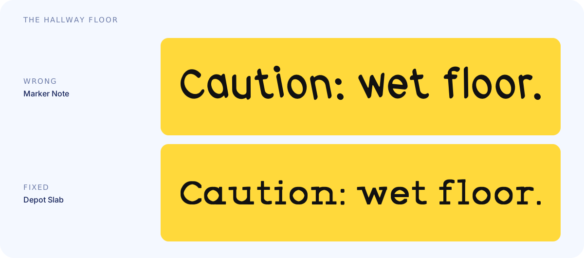
Wrong: Marker Note. Written by someone's cousin, in marker, in a hurry. Do not trust this sign. Do not trust the cousin.
Fixed: Depot Slab. Now it means it. Heavy, square, impossible to miss. Nobody slips on a slab.
The lemonade stand
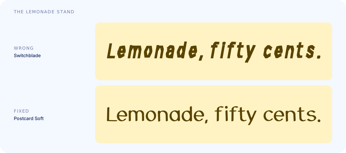
Wrong: Switchblade. Lemonade with a record. Fifty cents, cash only, and please do not make eye contact with the pitcher.
Fixed: Postcard Soft. Round, bouncy, a little wobbly. You would walk across the street for this lemonade.
The letter from the bank
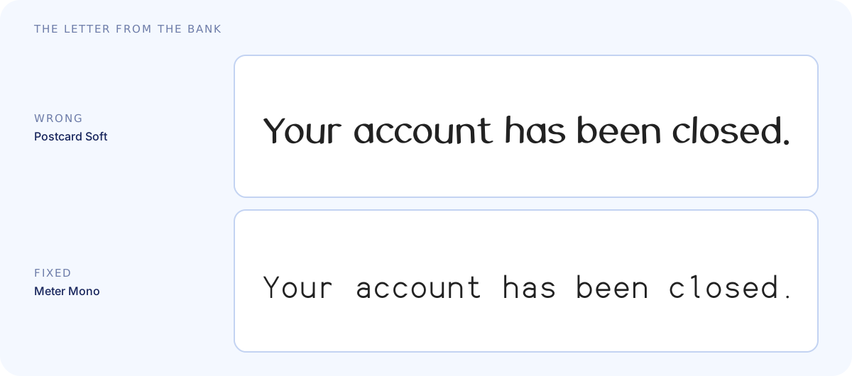
Wrong: Postcard Soft. Cheerful. Round. Smiling at you while it closes your account. Somehow that is worse.
Fixed: Meter Mono. Calm, exact, even. No warmth, and no argument either. It is the right voice for a bank.
The tasting menu
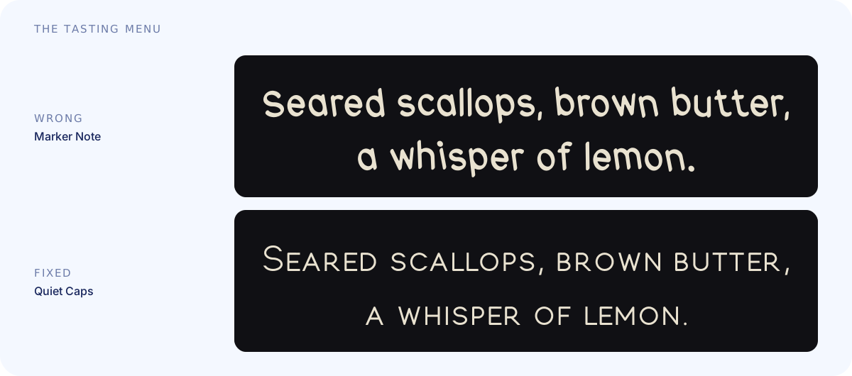
Wrong: Marker Note. Scrawled on a napkin by the chef's nephew. The whisper of lemon has been crossed out and replaced with "lemon?"
Fixed: Quiet Caps. Small, spaced-out capitals. Hushed and expensive. Somebody at the next table lowers their voice.
The note under your windshield wiper
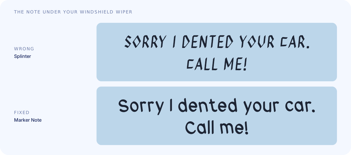
Wrong: Splinter. Jagged capitals, cut from a magazine in spirit. This is not an apology. This is a ransom note, and you are the ransom.
Fixed: Marker Note. Wobbly and sheepish, with the phone number written twice in case. You call. They bring cookies.
What you just felt
Nothing about the words changed. Only the letters did. Before you read a word, the type has already told you whether this is a wedding invitation, a warning label, or a bedtime story.
Nobody taught you to read type this way. You just do. It is the same sense that tells you a lost cat poster should not look like a legal notice, and that a bank should never smile at you while it closes your account.
This is what Fontdial is for
For a long time, letters of your own were something only big brands could pay for. Everyone else picked from the same shelf of defaults and lived with the gap between the feeling they wanted and the font they had.
That made sense when making things was expensive. It is not anymore. If you can build your own product, your own page or your own poster, you should be able to build your own font.
That is why I made Fontdial. You start from a feeling (friendly, playful, clean, elegant, trustworthy, vintage, bold, edgy, handmade or techy), pick a base font that is close, and dial it in with the sliders until it fits.
Your turn
What is the worst font you have ever seen on a sign? Tell me or send me a picture at [email protected].
Dial in a font that's yours. Free, in your browser.
Try Fontdial